Verily Website
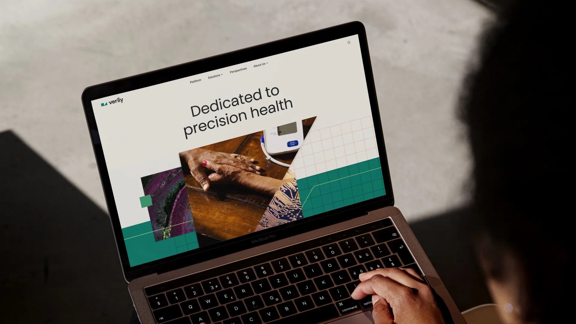
Precision design for precision health.
Verily, originally born out of Google X, started as a company focused on embracing innovative and diverse projects. While this approach led to significant medical discoveries, it also resulted in a brand that lacked clarity and a website that left users confused.
To address this, Verily streamlined its offerings and built a brand centered around bridging the gap between evidence generation and patient care.
The end result is precision health, where care is tailored to each patient's unique circumstances, rather than a one-size-fits-all approach.
At AKQA, I contributed to the UX strategy and was responsible for crafting the UI design for Verily.com. We developed a new design system, meticulously codified in a comprehensive design and component library, ensuring the site can evolve seamlessly as Verily continues to grow.
Agency | AKQA
Deliverables | Senior Designer, Design System, Experience Design
Verily’s old site design


Verily Design System
To maintain a consistent design system throughout the project and ensure a seamless transition from design to development, we utilized design tokens. These tokens allowed for quick updates and changes, automatically propagating modifications throughout the design, which saved valuable time and effort and enhanced workflow efficiency.
Our team took advantage of Figma’s robust design token capabilities to export and integrate these tokens into development workflows, ensuring that our design decisions were accurately implemented in the final product.


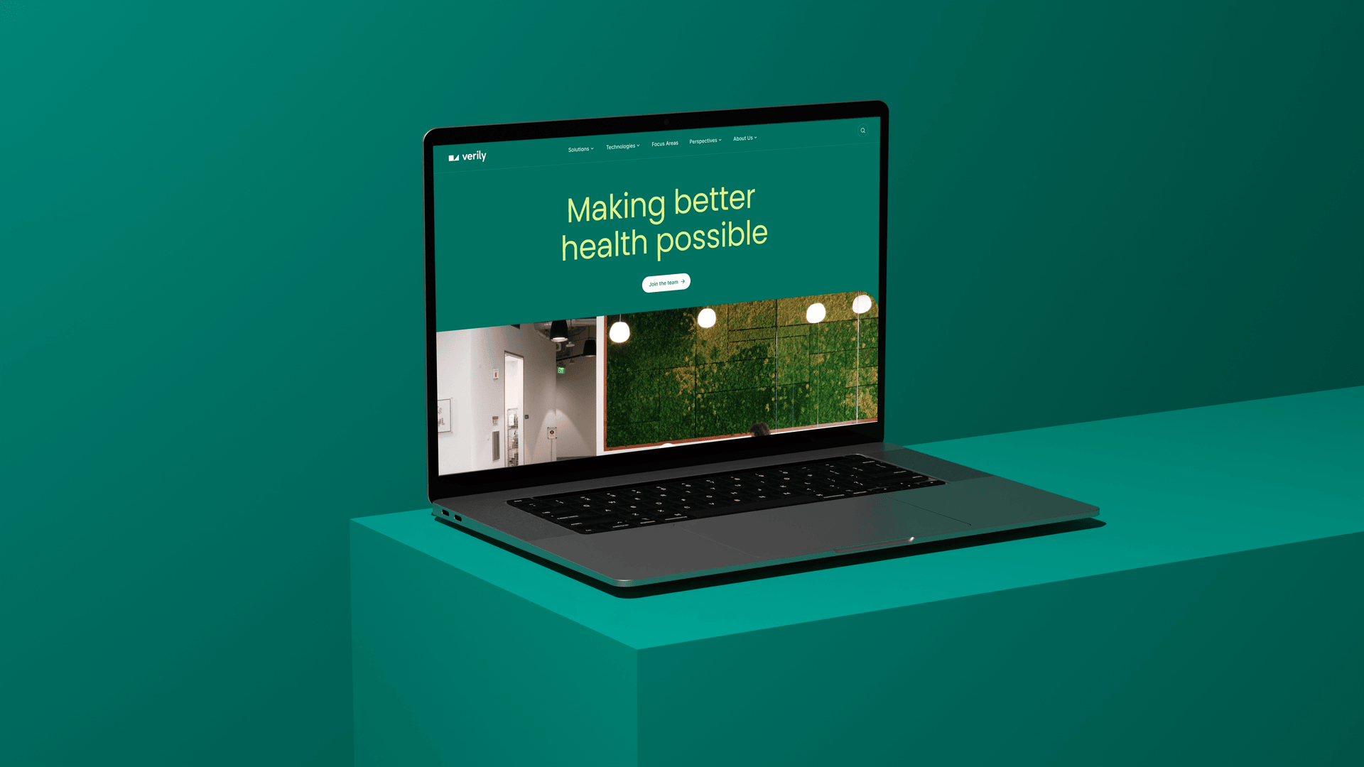
Differentiation now and in the future.
Verily.com brings Verily’s flagship solutions to the fore, providing a rich, editorial content hub fused with the diverse and expert perspectives, a go-to source for trusted solutions and insights that are shaping the health tech landscape.